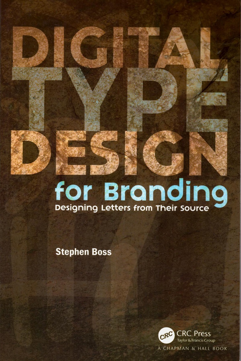
Digital Type Design for Branding. Designing Letters from their Source *
The approach will be to give visual aid (illustrated) and written reference to young designers who are either launching their careers or taking their first stab at designing letterforms for a
logo, lettermark, signage, advertising or an alphabet. The book will focus on the roots of each letterform and give the designers the knowledge of why weight variations (stress) exist and
how to correctly apply them to their designs.
Key Features
- A how-to resource for designers to referencee while designing letterforms.
- The designer will be left with a clear understanding of why letterforms look the way they do, and the moethod and order of letterform development, enabling the designer to draw on history
- when developing their glyphs.
- How-to illustrations will highlight the process and downloadable vectors will give the designer templates to begin their project.
- This book gives designers a solid footing when designing a series of characters without developing a complete alphabet.
- Custom typography is a growing trend and every newly minted designer should have a practical knowledge of the origins of letters and the method of building letterforms.
Criticas
«Probably the best biography of a cartoonist ever written, and is surely one of the best dozen or so books on comic art ever written . . . John Canemaker’s text is that great and most welcome rarity, a
genuine work of scholarship about a cartoonist . . . a model for other books about comic art.»
— Michael Barrier, The Comics Journal
«This is one book that anyone interested in our cultural heritage can’t afford to miss.»
— Art Spiegelman, USA TODAY

